Monday, 29 March 2010
My second draft of my webpage

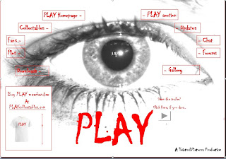
This is the second draft that i created for my webpage. This is unfinished as half way through some of my class mates commented on some aspects of my page which made me decide to start over to make it better.
I was told that it was far too cluttered and hard to read. I was also told that the layout did not work and that everything was too spread out on the page and there was not enough structure.
Another comment that i received was that the "help" caption in the center of the eye was far too comical and added a comic effect to the website.
Another set of feedback that i received was that the red font that i used was too hard to read and that the page was too bright so therefore the writing did not stand out.
I then decided that when i would create my next draft i would use the "burn tool" throughout so it creates a more eerie and spooky effect to the page and so the writing stands out and is easier to read.
I also wanted to use boxes in my next draft so the whole page could be more structured and appear to be easier to use. I was also told that if i use boxes throughout my page would look neater and less cluttered so therefore is more appealing the my target audience.
I will now upload my final webpage design which i created using all the criticism and feedback that i received from my class.
My Webpage
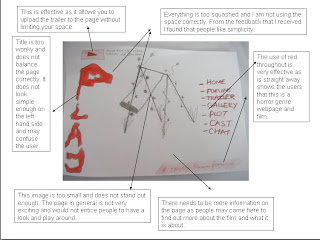
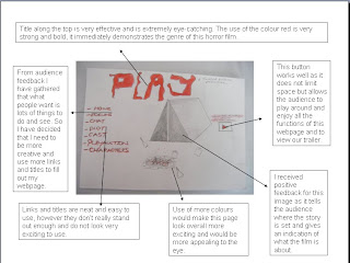
After gaining much audience analysis and feedback for my website i decided that i wanted to start over. I wanted to take all the criticism that i gained and use it to my advantage. I created a webpage and asked for feedback and was told that it was far too cluttered so i therefore decided to analyse my design to i could re-do it making it better and more suitable for my target audience.
Uploading our film trailer
Me, jade and hannah are having difficulties uploading our trailer to our blog. We saved it onto a memory stick and tried to upload it from there but it didnt work.
Instead we have decided to burn our trailer onto a CD as this is a quicker and easier way to do it.
Instead we have decided to burn our trailer onto a CD as this is a quicker and easier way to do it.
Monday, 22 March 2010
Me, Jade and Hannah...
Are now editing our trailer. We wanted to wait to shoot in the dark and when it was not raining to create greater suspense and fear throughout our trailer, however we did have to put filming on hold for a while due to bad weather conditions. We have now finished editing the majority of our tailer but we want to ask some people for some feedback so we could be sure that it is suitable for our age group.
While editing our footage we came across a number of difficulties such as finding suitable music without the problem of copyright. The music available to us we found was extremely dull and limited. We then decided to have a quiet noise in the background to create suspension rather than music. We firstly used a piece of music which was fast paced and eerie, but however after gaining audience feedback we decided to put this at the end of our trailer which builds up a dramatic impact and instead used a more subtle tune at the start to keep it simple and ease you into the trailer.
Another problem we came across was getting each clip to run into each other smoothly and easily. This required us to do a lot of cropping and changing for quicker clips which made it ore fast past and exciting for the audience which is what we wanted to achieve.
In our earlier research of analysing film trailers we came across a number of factors which we also wanted to appear in our film trailer. This included credits at the end, more snappy words and phrases which informs the audience more about what is going on and hightens the scary element. However one problem we came across when adding the titles was that we was not able to add them over the top of clips in the trailer so had to make individual slides.
Wednesday, 17 March 2010
What next...
I am now going to use the ideas that I learned through my audience analysis of my webpage to create my final design which will suit my audience’s needs and will be eye-catching and popular.
This is the first draft of my webpage
What Next...
I am now starting the process of creating my website to pormote my horror film. I have created 3 draft sketches which i will get feedback from my class for so i can create a better image which suits my target audience better and that will be most appealing.
Our New Member: Jade Lauren Mercedes Payne
Due to unforeseen circumstances Jade Payne has now joined mine and Hannah’s media group. Jades partner left school and this left her on her own to create her trailer, poster and webpage. As this is too much work for one person Hannah and I wanted Jade to become a member of our group as this would be highly beneficial to us to have an extra person throughout the film trailer process. Jade will now be analysing posters, trailers and webpage’s to gain a greater understanding of the horror genre and will be joining us in the creation of "PLAY".
About my images
These are some of the photographs that I have taken to use for my horror poster. I wanted to use an eye as I wanted to grab my audience’s attention as soon as they look at the poster. I took a photograph of 2 different colours of eye, blue and brown as I wanted to play around with all the different Photoshop elements to see which one would look most effective as a poster. I then asked some members of my class which one they found most eye catching and the majority agreed that the blue eye was the most effective of the two so i decided to carry on creating my poster using the blue eye as I also felt it was the one that stood out the most. Before capturing my image, I put mascara on the eyelashes and splashed water over the eyelid so it would look more effective and realistic for the audience.
Subscribe to:
Comments (Atom)


